Using CSS Preprocessors
13 Nov 2019
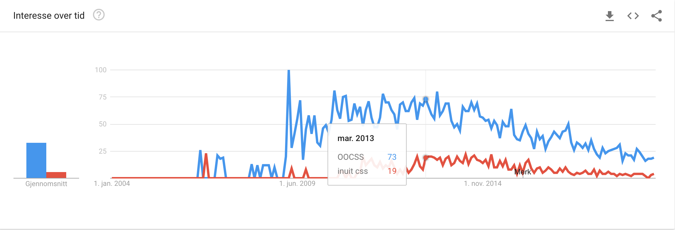
I was very comfortable with HTML and CSS back in the days, and had a significant interest in “working smart – not hard”. I read up on different resources, like the Wordpress style guide, Object Oriented CSS and Inuit CSS.
Here’s how they’re trending these days:

Then came SASS, LESS and other CSS preprocessors, making things even more interesting. Alas, I didn’t have the technical proficiency for setting up the environment, nor the time to prioritize and learn. During this course, I got the chance to revisit it though.
CSS preprocessors, are frameworks generating plain vanilla CSS from input utilizing the framework’s own syntax and functionality. The point is keeping development DRY. Reading up on streamlining stylesheets, I’d learned that it’s quite common for stylesheets to have literally hundreds of references to the same color code, the same font stack etc. With preprocessors, style guides could be implemented and maintained through variables, which to me seemed like a stroke of genius. Other common features are nested rules, inheritance and mixins – all sought-after features.
We were warned by the course instructor that this might be the last time he’d teach CSS preprocessors due to declining general interest as a result of developments within CSS freeing developers from the need. Looking it up on Google Trends (again) seemed to indicate decent interest either way:

Compared to regular CSS, preprocessors allow DRYer and more structured stylesheets, which should be easier to maintain. It’s unfortunate that preprocessors’ structuring and nesting inherently cause unnecessary specificity and “bloat”, i.e. “ugly” output CSS.
Considering this use case, using Jekyll, I’ve already stated that I see Static Site Generators as most appropriate for private projects of a lesser scale. CSS preprocessors on the other hand, show their advantages on the grander scaled projects. Consequently, I see a inconsistency here. There shouldn’t really be a need for preprocessing the CSS of quick & easy static web sites.
Usage on this site
As for my use of SASS in this project, I’ve tried to implement the different features despite keeping things simple design-wise, i.e. not changing a lot from the default “minima” theme.
-
Colors have been implemented through defining a simple primary, secondary, bg-color, and link-color as variables. Shades and tints of these are generated through SASS color operations, leaving me with basically 4 lines of CSS to manage the site’s complete color theme. E.g.:
border-top: 1px solid rgba(invert($bg-color), .1); -
A grid scale has been defined, facilitating grids-based layouting. Margins and paddings are given as SASS math operations multiplying the grid scale with the desired value. E.g.:
margin-top: 8 * $grid-scale; -
Extending / inheritance has been used to allow different elements to inherit the same rules. E.g.:
h2.post-list-heading { @extend %section-divider-default; } -
aelements use nesting mostly for show. I’m a bit uncertain at this point, to what extent I’d use nesting in practice.